-
 0–Rank 0 0 up / 0 down
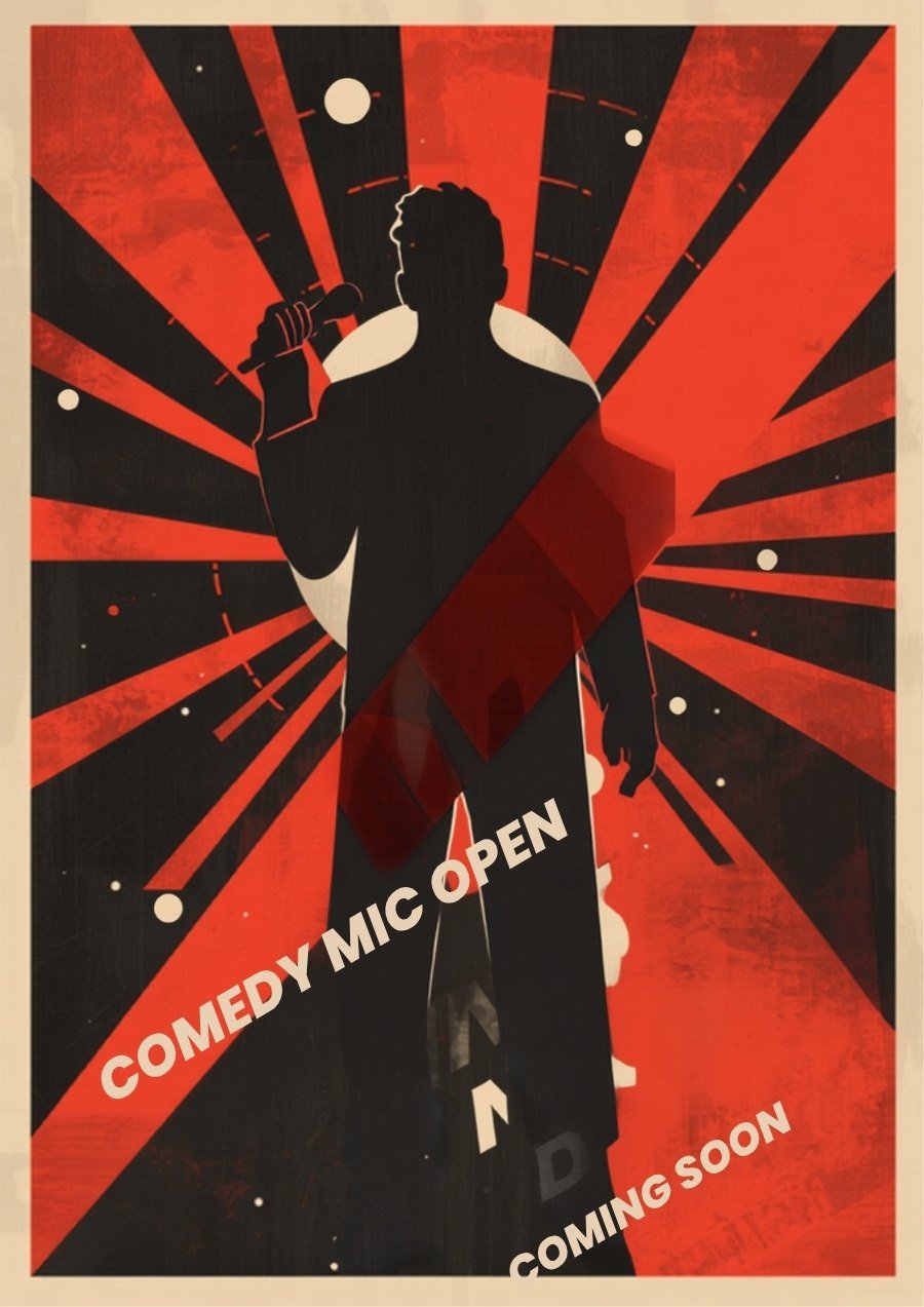
Agitprop B
Sunburst behind the figure, type on the diagonal
The Russian agitprop poster is the oldest trick in comedy advertising: make one person enormous and put the sky behind them. The rays are struck off-centre so the raised arm cuts the brightest wedge, and the words run up the same diagonal rather than sitting level — a set builds upward, and the lettering should too. Two inks, cream and vermilion, because a third colour asks the eye to make a decision it doesn't need to make.
See the full poster Tap to close -
 0–Rank 0 0 up / 0 down
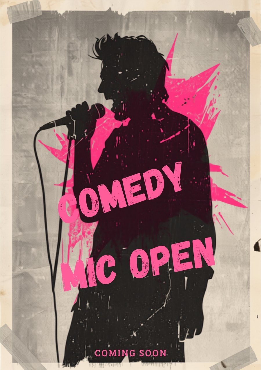
Taped Up
Pink on grey, four strips of tape holding it to the wall
A photocopy of a photocopy, taped to a wall rather than framed. The magenta reads less as a colour choice than as the one cartridge the shop had left, which is exactly the register an open mic should be advertised in. The tape at the corners is doing real work — it says this poster was put up by a person, not printed by a venue.
See the full poster Tap to close -
 0–Rank 0 0 up / 0 down
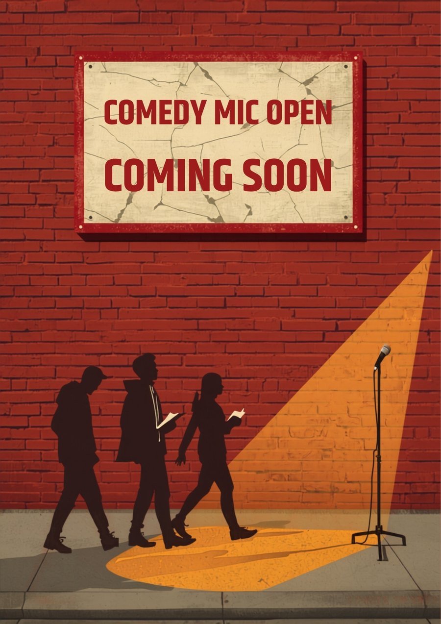
The Sign
Painted board on brick, three people walking into the light
The only poster in the set that shows the room instead of the act. A sign on a brick wall, a mic stand waiting in a pool of light, and three silhouettes walking toward it — the moment before anything happens, which is the moment a coming-soon poster is actually about. Warm spotlight against cool shadow does all the work.
See the full poster Tap to close -
 0–Rank 0 0 up / 0 down
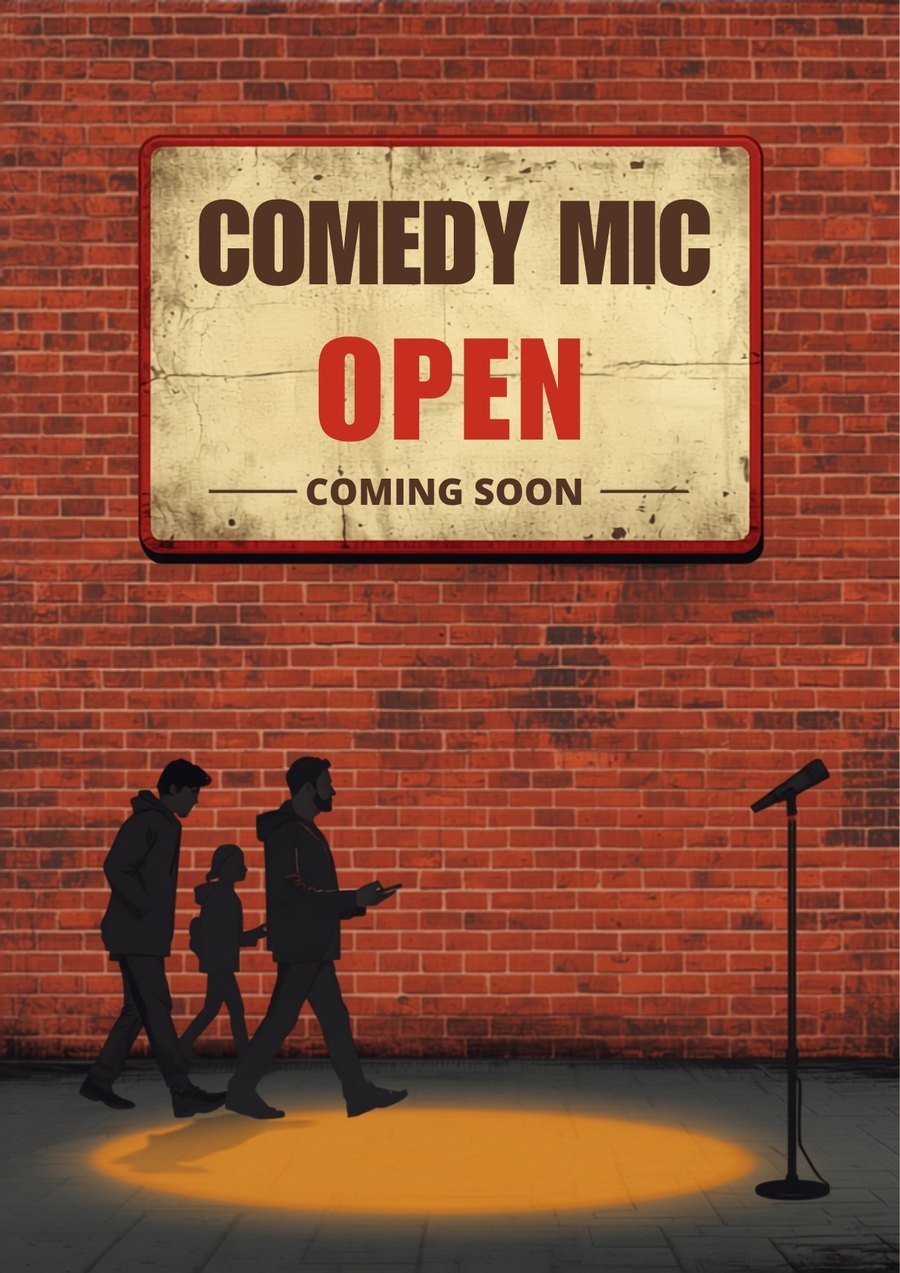
Tin Sign
Weathered enamel sign, same corner, different night
The same scene as The Sign, rendered as a battered enamel plate instead of painted board, with the type stacked in three weights so OPEN carries the line in red. Two figures instead of three and a tighter pool of light. It's the quieter of the pair — worth seeing which one people actually pick.
See the full poster Tap to close -
 0–Rank 0 0 up / 0 down
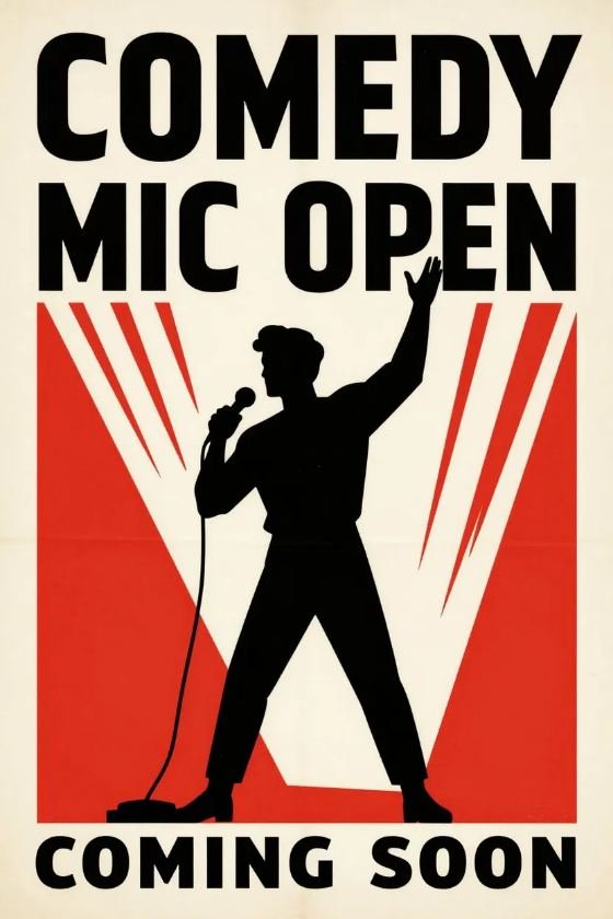
Red Block
The sunburst flattened into a single field
Constructivism with the rays reduced to a hard red rectangle and four white chevrons — the poster equivalent of cutting a bit down to its last line. The figure is inset in the block rather than laid over it, so the red frames the performer the way a stage light does. Black type above, black type below, red doing all the shouting in between.
See the full poster Tap to close -
 0–Rank 0 0 up / 0 down
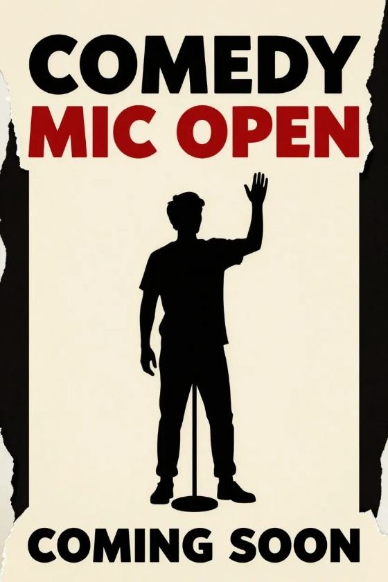
Torn Frame
Heavy type stack over a ripped edge
The strongest type hierarchy of the nine: COMEDY at full width in black, MIC OPEN dropped into red beneath it, COMING SOON anchoring the base — three weights, one column, no ornament. The torn right edge is the single liberty taken, and it exists to stop a very rigid grid from reading as an annual report cover.
See the full poster Tap to close -
 0–Rank 0 0 up / 0 down
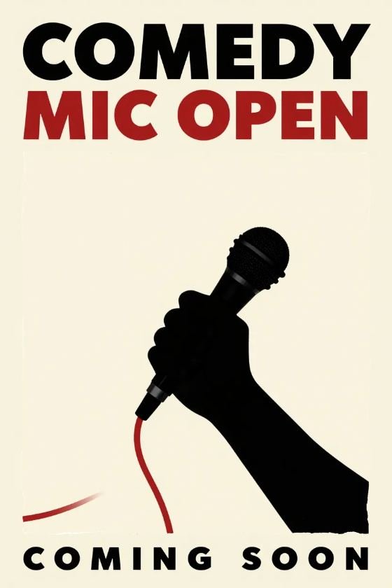
The Mic
No comedian at all — the object carries it
The one poster with nobody in it. A fist and a microphone, cropped so hard the arm leaves the frame, the cable trailing off in red. Taking the person out is a risk on a poster advertising people, but it makes the mic the invitation rather than the performer — which is what an open mic actually is. Widest letter-spacing in the group, to give the object room.
See the full poster Tap to close -
 0–Rank 0 0 up / 0 down
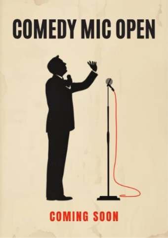
Profile
Turned side-on, mid-sentence, hand open
The most understated of the nine. The comedian faces the mic instead of the room, so we're watching from the side of the stage rather than from the seats — an angle almost no comedy poster uses, and one that makes the whole thing feel like a rehearsal rather than a show. The open hand is the only motion in the frame.
See the full poster Tap to close -
 0–Rank 0 0 up / 0 down
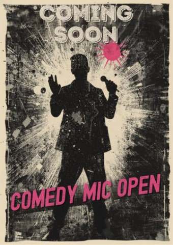
Third Generation
Photocopied until it blew out, magenta on soot
Where Taped Up is a flyer, this is what happens when the flyer gets copied five more times: midtones gone, only soot and blowout left, the figure barely holding together. Type at the top and bottom, artwork punched through the middle — the layout every punk gig flyer since 1977 has used, because it survives being photocopied and it survives rain.
See the full poster Tap to close
Comedy Mic Open
Every open mic, every show, every room, every comic — DC, Maryland and Northern Virginia, in one place. We’re building it now.
Nine posters, one wall. Tap to turn one over · Vote for the one that goes up.
Wall: Jakob Braun / Unsplash